Most of our front-end code is now written with AI coding agents. They are fast, and they are very good at doing what the code around them already does. Point an agent at a screen with a hand-picked color and a home-grown modal, and the next screen gets another hand-picked color and another home-grown modal.
Our 2026 brand guidelines meant redesigning our web apps, and redesigns had always meant touching every screen by hand. This time we tried the opposite order. Before building a single component or moving a single screen, we wrote down the rules of a design system where agents would read them and put the important ones in CI. Then we moved the Carbon Arc platform, where our clients find and analyze current, real-world data, onto the result: @carbonarc/ui. Two pieces did most of the work: ratchets, which are checks that let a count of old patterns fall but never rise, and a gap ledger where an agent can record where the system falls short.
AI agents copy what they see
A design system is the shared set of colors, type, spacing, and components that every screen is built from, plus the rules for when to use each one. Most teams keep it in three places: a design file, a component library in code, and documentation that explains the choices. When the three agree, a new screen is mostly assembly. When they drift apart, every screen becomes a small redesign.
We had pieces of several systems, and each redesign added its choices on top of the last. The platform used Flowbite with some Ant Design, the admin tool used Radix-based components with some MUI, and charts came from three different libraries. Each screen picked its own spacing, radius, and hover states, usually inline.
Before writing a rule, we measured. The two apps held 18,168 hand-set pixel values in 1,005 files, and 2,179 labels in Title Case against our own sentence-case style. Orange appeared 543 times in 111 files, written 61 different ways: the brand hex, Tailwind’s stock orange (a different color), its shades, and the brand color retyped with a hand-picked opacity. Only 38 of the 543 were the brand hex itself. Any front end that has grown quickly looks something like this. What changes with agents is that an agent’s real style guide is the codebase it works in, so every one of those inconsistencies is a pattern it can repeat.
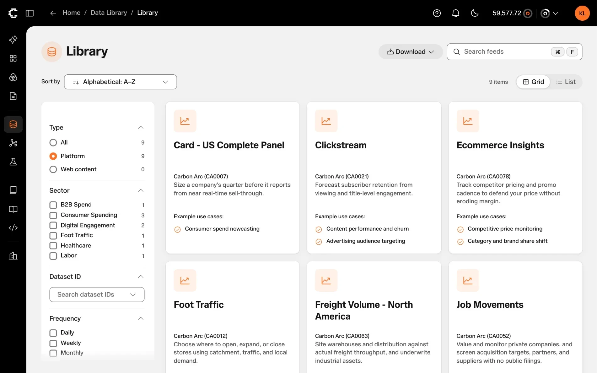
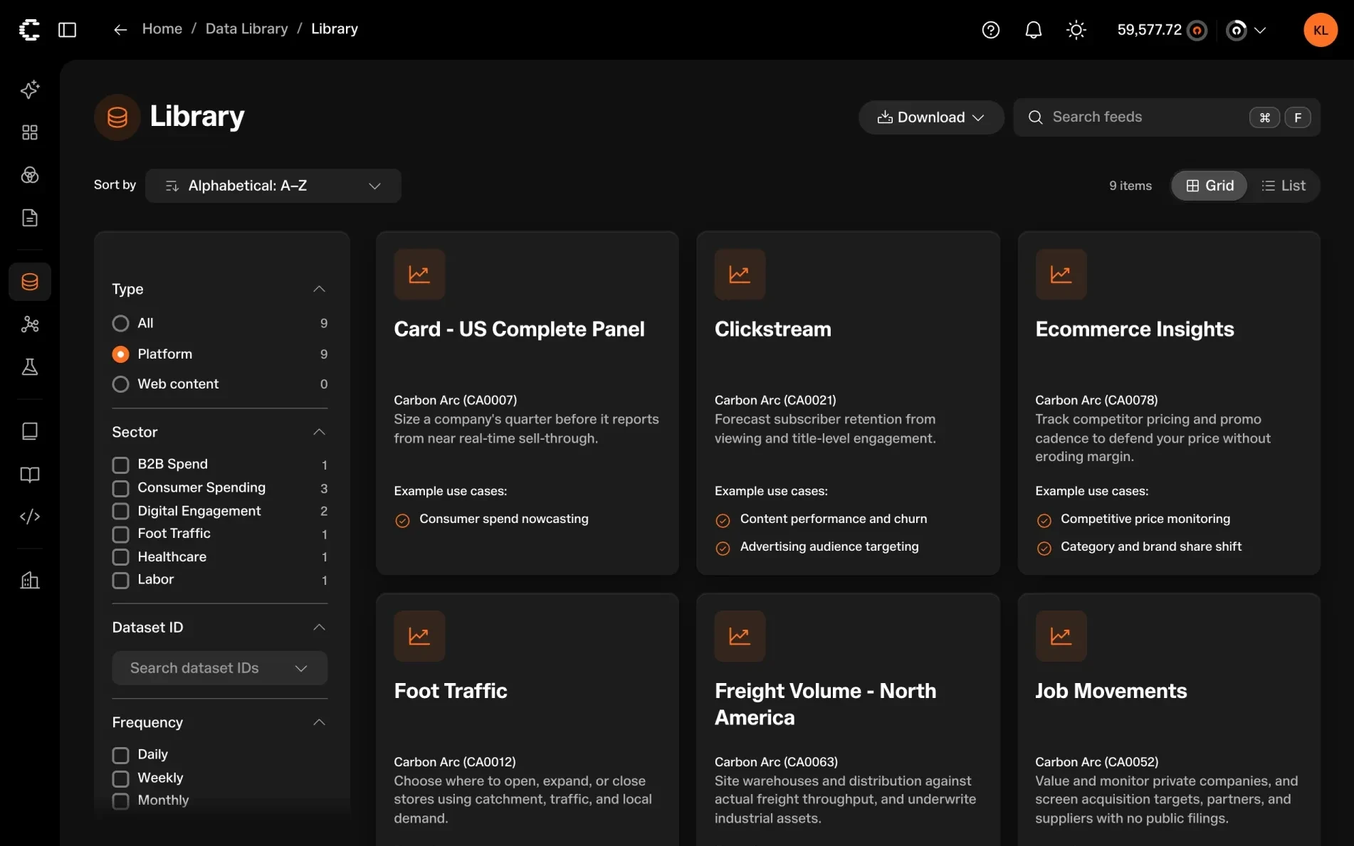
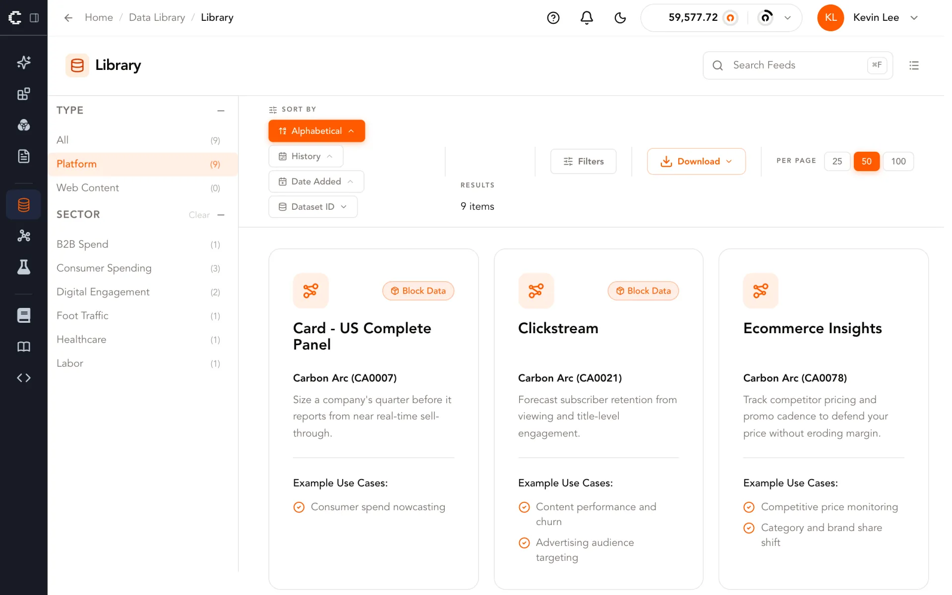
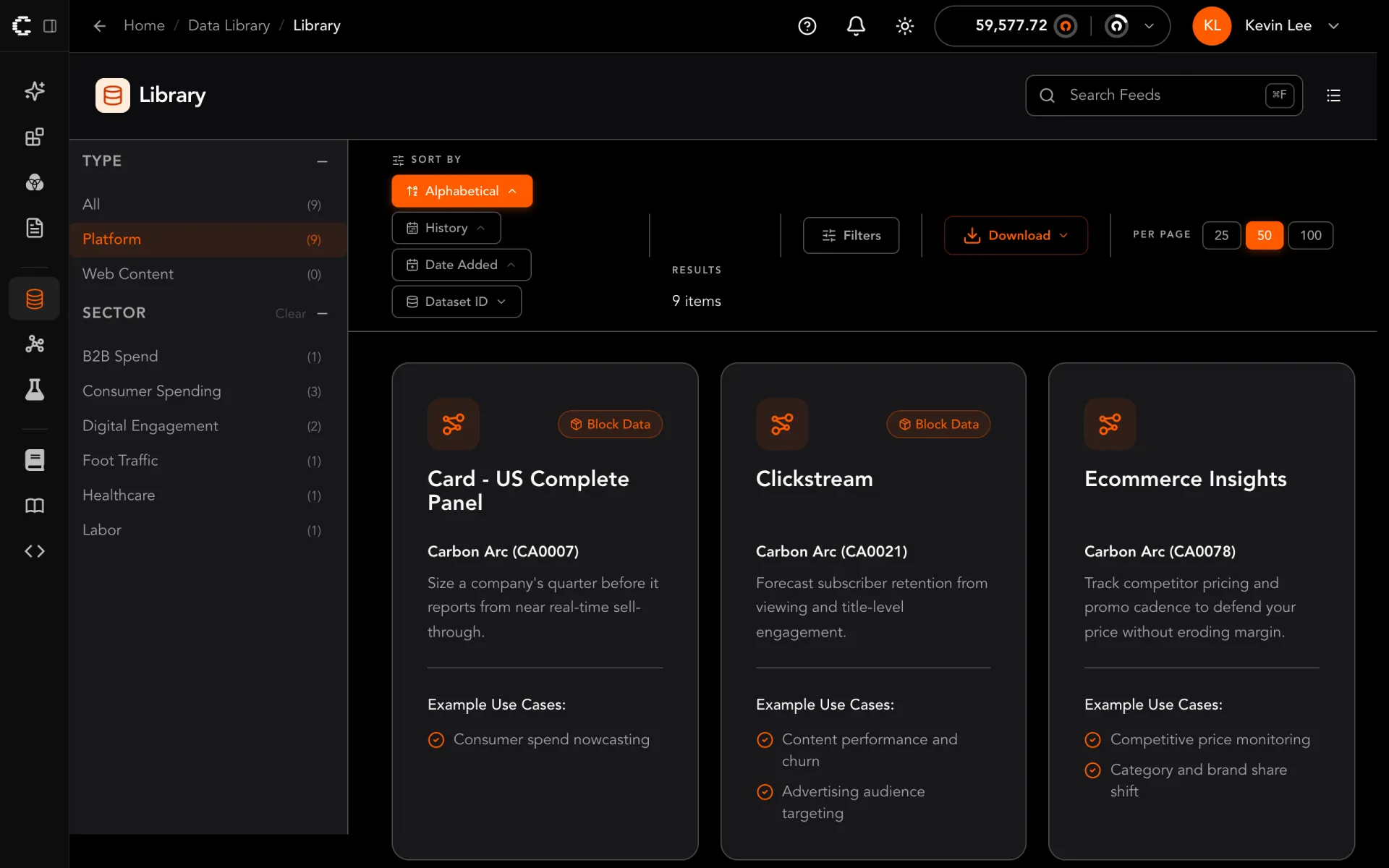
- Sort is one dropdown instead of four stacked buttons.
- Download is a neutral secondary button, so it no longer competes with the filters.
- Filters are standard radios and checkboxes, and orange marks only the one that is on.
Rules before components
We started with documents, not code. Our repository uses AGENTS.md files: plain-language instructions that a coding agent reads whenever it works in that folder. The design system’s files say which component to reach for, which corner radius a container gets, how spacing depends on how related two things are, and when a one-off component belongs in the shared package. The first of them was written alongside the first prototype button, and no screen moved onto the system until its rules had been checked against our brand guidelines.
Those guidelines were written with our marketing site in mind, and the site, along with this blog, adopted them first. A data product needs things a marketing page does not, so the system adapts the guidelines in writing, with a reason for each departure: a product type scale for dense screens, an eight-hue chart palette that holds its contrast in both themes, and figures set in our monospace face because the display face has no tabular figures.
None of this ordering is new on its own. Test-driven development writes down what correct behavior looks like before the code, and design systems brought the same idea to interfaces. The practice of shaping a codebase so agents get things right now has a name, harness engineering. Mitchell Hashimoto describes engineering the harness so an agent’s mistake does not happen twice. OpenAI wrote about encoding taste in custom lint rules, and Birgitta Böckeler sorts the controls into guides an agent reads before it acts and sensors that check its work after. We applied that to a design system and put the rules first: the rules and their checks existed before the components and screens they govern.
Agents follow written rules literally, which is both the point and the risk. One of our icon rules said that if the system already has an icon for an idea, use it, even when another glyph would look better in one place, because consistency across screens beats fit on one. Agents moving the side navigation onto the system did exactly that, and icons people knew turned into generic ones: the link to our docs became an info icon. No check failed, because the rule had been followed. The rule was wrong for a migration, so we changed it: an icon people already see keeps its picture, matched to the closest glyph in the new set. Every agent picked up the change the next time it read that folder, and the same edit by hand would have meant finding every screen that had already moved.
Every visual decision lives in a token, a named CSS variable, in one of three layers. Primitive tokens are the raw palette and scales, named for what they are. Semantic tokens name a job, such as the color of an action or of a surface, and point at a primitive. Component tokens map those jobs onto the parts of one component, such as a primary button’s background.
/* Primitive: what the value is */
:root { --ca-orange-500: #ff7125; }

/* Semantic: what it is for, declared again for dark mode */
:root, .dark { --ds-action: var(--ca-orange-500); }

/* Component: who reads it */
[data-slot="base-button"][data-variant="primary"] {
  --base-button-bg: var(--ds-action);
}
Components only read their own tokens, so each decision is made once. Dark mode is the semantic layer declared a second time. A denser layout for admin tables is the same components with smaller size tokens.
We wrote the workflows down too: a shared brief for migrating a screen, a reusable agent skill for reviewing a migration against the rules, and a screenshot harness that shot each screen in both themes before and after. Migrating a screen became a task we could hand to an agent and check.
Guardrails that hold without a reviewer
Written rules are only half of it. Lauren Tan of SpaceX Super Intelligence recently made the case for fixing each agent mistake at the strongest layer available: make it impossible in the code if you can, catch it in lint or CI if you can’t, and rely on written rules last, because agents lose track of prose on long tasks. That matches how our rules evolved. We wrote everything as prose first, because prose is where you decide what a rule should be, and then pushed the important rules down a layer. Tokens make a stray color impossible inside a component, and CI catches what tokens cannot.
What that advice does not cover is a codebase that already breaks the rule. You cannot turn on a lint rule against hand-set pixel values when there are 18,168 of them. So most of our checks are ratchets, the same idea Notion described for its ESLint rules. Each one counts something we want gone, such as hand-set pixel values, Title Case labels, home-grown loading spinners, or click targets that are too small, and stores the count per file. A pull request can lower the count but never raise it. No one had to fix 18,168 values at once, and no agent can add the 18,169th. The 9,611 left are mostly in screens that have not moved yet, and each one that moves takes its count down. A few checks are absolute from the start: a group of buttons can have only one primary action, and the logo has to follow the brand guidelines.
The checks are written for an agent to read. When one fails, it names each offending line and the system’s replacement for it, so the agent that broke the rule can usually fix it in the same session.
The other piece we would recommend is a gap ledger. A strict system with no way out gets worked around: when an agent needs something the system does not have, its easiest move is to build a bespoke version on the spot. So we gave it a legal way out. It uses the nearest existing component, leaves a DS-GAP comment with an ID, and CI checks that every ID points to an entry in a shared ledger. Evil Martians recently described a similar gaps file for agents. Having CI enforce ours is what kept it honest. The ledger has 84 entries so far. Of those, 24 became new components or options, 6 were accepted as one-offs, and 54 are still open. It is the system’s roadmap, written by the screens that needed it.
2. **A new name means a new concept.** If the registry already has an
   icon for the idea, use it even when another glyph would look better in
   that one place. Consistency across screens beats fit on one.
   **Migrating an icon people already see is the exception: match it 1:1.**
   When a screen moves to the design system, its icons keep their picture:
   the nearest glyph to the production icon, registered under its own
concept if no existing one draws it.$ node packages/ui/scripts/check-spacing.mjs
✗ src/components/SectionLayout.tsx: 25 hand-set distances, baseline 0
21: gap-2 → gap="related"
21: px-3 → a role from Patterns › Spacing
50: gap-1 → gap="tight"
71: ml-[1.4rem] → the parent's gap
…
Spacing comes from a Page template or a relationship role (Patterns › Spacing).
Run node packages/ui/scripts/check-spacing.mjs --update only to record fewer, never more.{/* DS-GAP(G42): top-only radius, cropped shell frame */}
<div className="h-[26rem] overflow-hidden rounded-t-[var(--ds-radius-panel)]">
<AppShell topBar={<TopBar brand={<TopBar.Brand product="Lenses" />} />}>"G42": {
"title": "Box has no one-sided stroke and no per-corner radius",
"status": "open"
}The checks do not retire when a migration ends. With the platform on the system, they are what keeps it there. A new screen cannot bring back a hand-set pixel value, a home-grown spinner, a Title Case label, or a second primary button, whether a person or an agent wrote it.
What the rules cost in tokens, and what they save
Rules are not free. An agent working inside the design system package reads about 40,000 tokens of rules before it writes a line, and one working on an app screen reads about 16,000. That cost recurs on every session, though prompt caching makes repeats cheap.
The return is that a change lands once and lands everywhere. Changing the brand orange used to mean finding 543 uses in 111 files, and a find-and-replace on the brand hex would have caught 38 of them. Today it is one line in a token file. Design system components read only tokens, so that line reaches every screen built from them.
Building the system and moving the platform onto it took well over a hundred agent sessions. Once the rules existed, the question stopped being whether a migrated screen was right and became how many sessions to spend.
What the design system looks like
The figures below are not screenshots. They are @carbonarc/ui itself, compiled into this blog from the same source the apps use. First come the foundations, then a small screen built only from the system’s components. Switching its theme changes only the semantic layer.
Color · 9 hues × 9 steps
Type · Marund Sharp
Harbor Coffee
- Monthly spend, $M
- 4.87
- −3.40%vs Aug
- Share of peer set
- 51.90%
- +1.20%vs Aug
Card spend vs peers
Apr to Sep 2026- Harbor Coffee
- Peer average
| Month | Harbor Coffee | Peer average |
|---|---|---|
| Apr | $4,460,000 | $3,910,000 |
| May | $4,690,000 | $4,080,000 |
| Jun | $4,810,000 | $4,260,000 |
| Jul | $4,920,000 | $4,390,000 |
| Aug | $5,040,000 | $4,470,000 |
| Sep | $4,870,000 | $4,520,000 |
Illustrative data
The same components now build Lenses, our chat interface, shown here before and after the move.
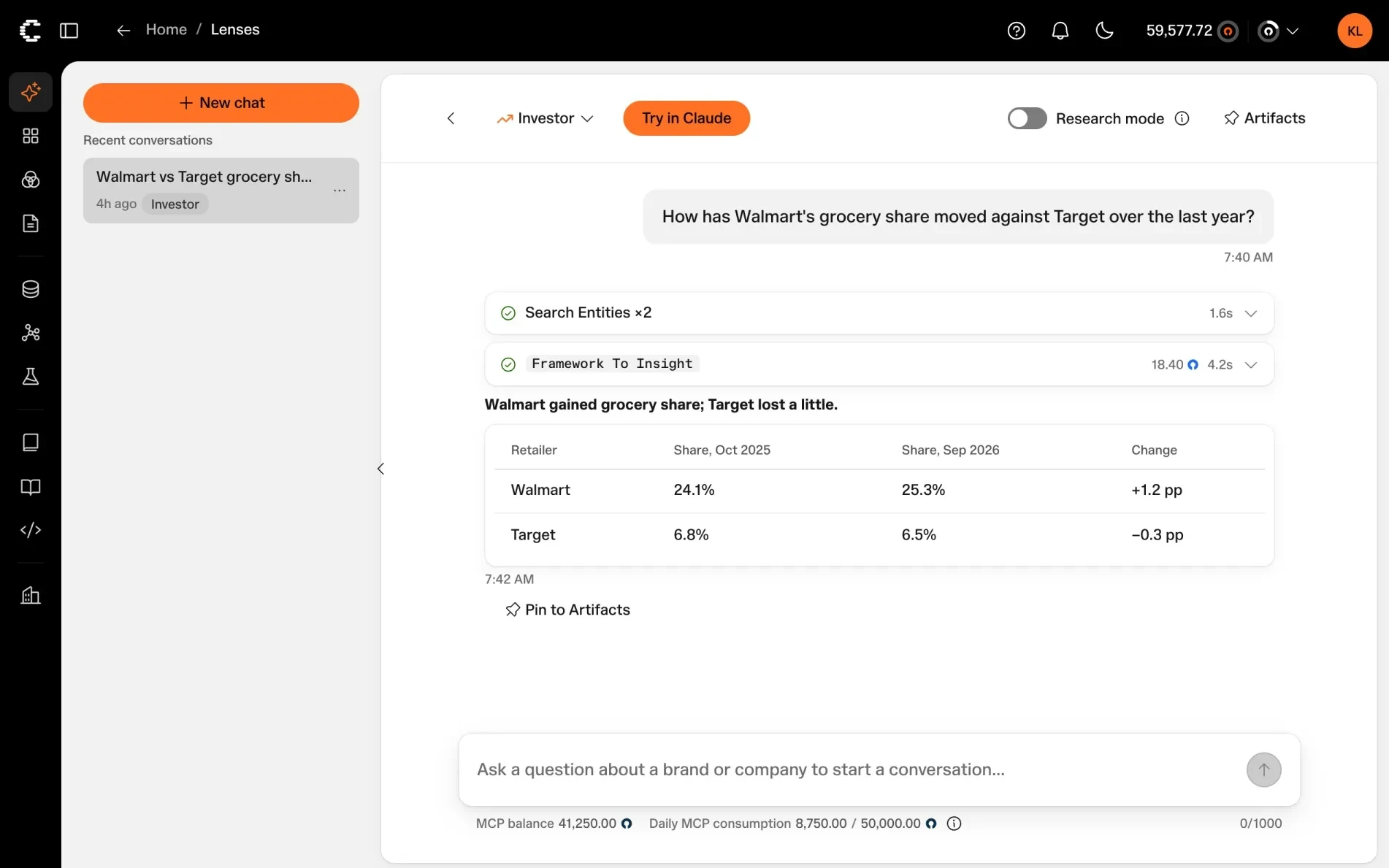
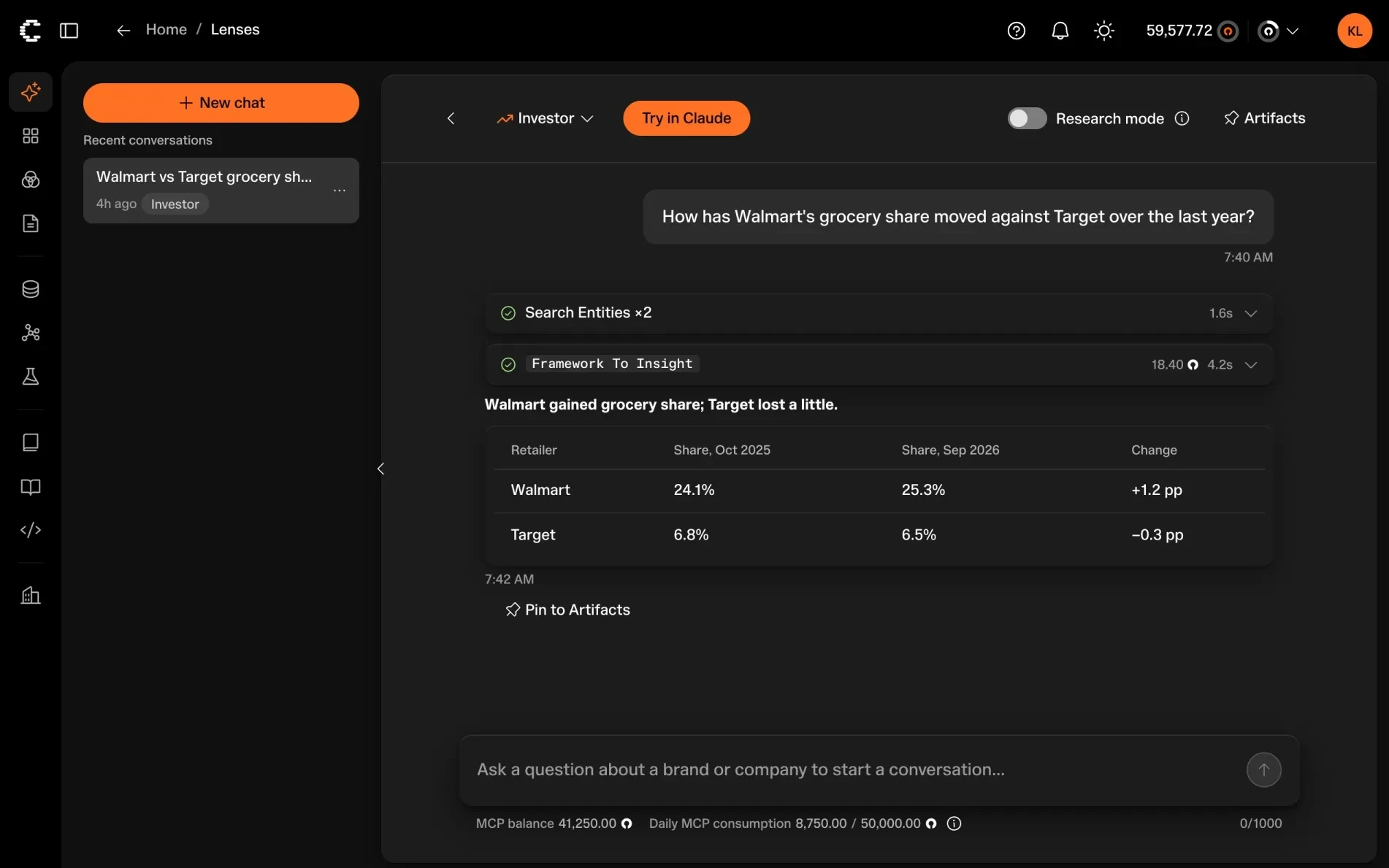
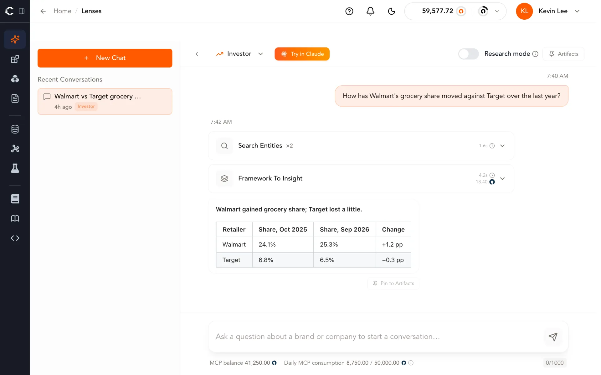
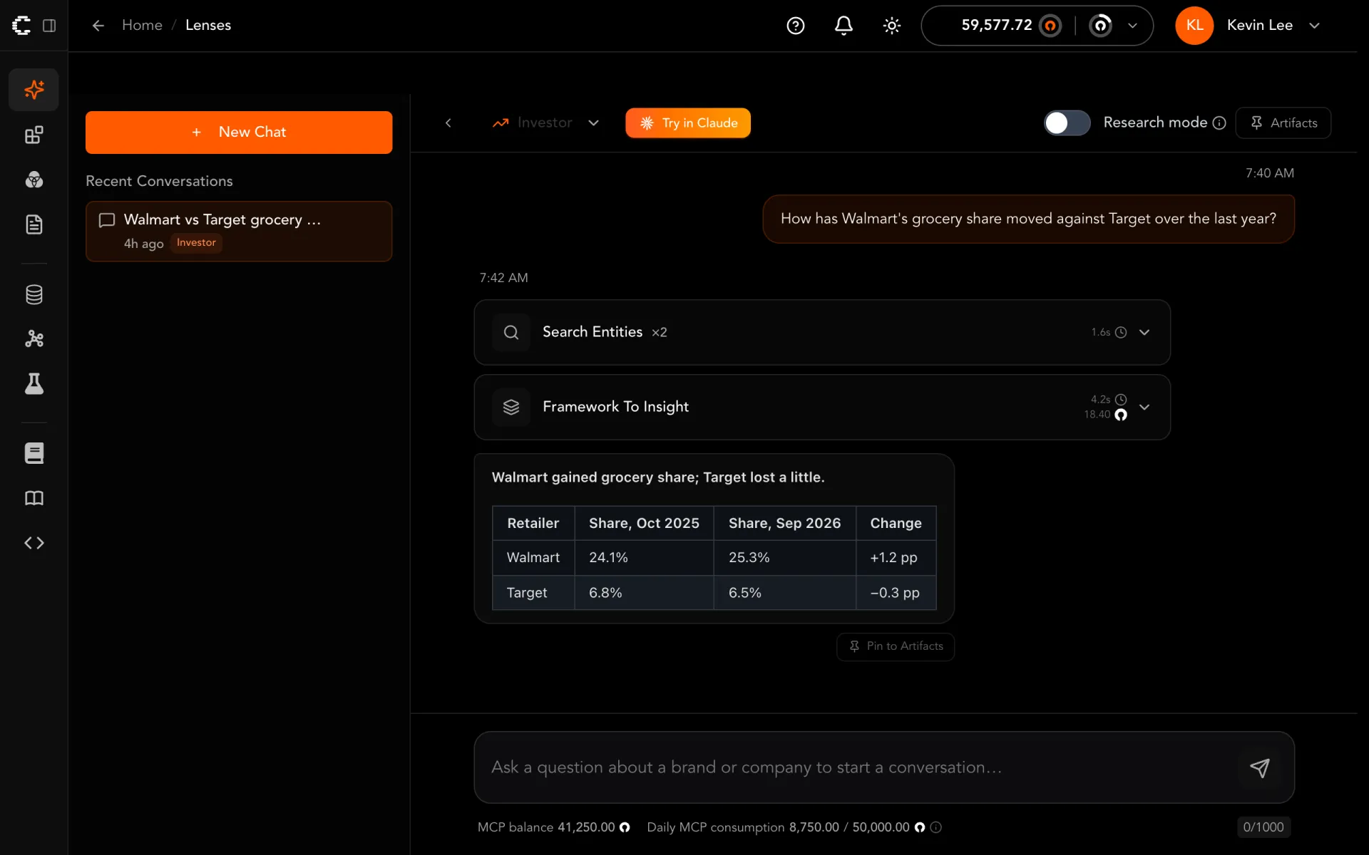
- Buttons and section labels are sentence case, as our style guide asks.
- The question sits in a neutral bubble, so orange is left for actions.
- The answer uses the system's standard table instead of a hand-drawn grid.
For people using Carbon Arc, the release brings:
- One type family and one orange, from our 2026 brand guidelines, across the platform.
- Buttons, inputs, menus, and tables that look and behave the same on every screen.
- A visible focus ring and keyboard access on every design system control.
- A Chart/Table switch and PNG and CSV export on every chart.
What we would tell another team
The payoff is in what comes next. A new screen now starts from components that already follow the brand, the spacing, and the accessibility rules, so consistent is the default rather than the goal. When we change our minds about a color, a radius, or how dense a table should be, the change goes into a token or a rule, and every screen follows.
Agents do not bring design judgment of their own. They apply whatever judgment is written down, consistently and at scale, whether it is good or bad. That makes the written rules the most valuable design artifact a team owns.
If you are starting out, write the rules before the components, give agents a legal way to say the system falls short, and let CI count what is left. Then the next redesign is a change to tokens and rules that an agent can carry to every screen, not another round of hand edits.
- design-system
- ai-agents
- frontend
- react
Written by
Kevin Lee